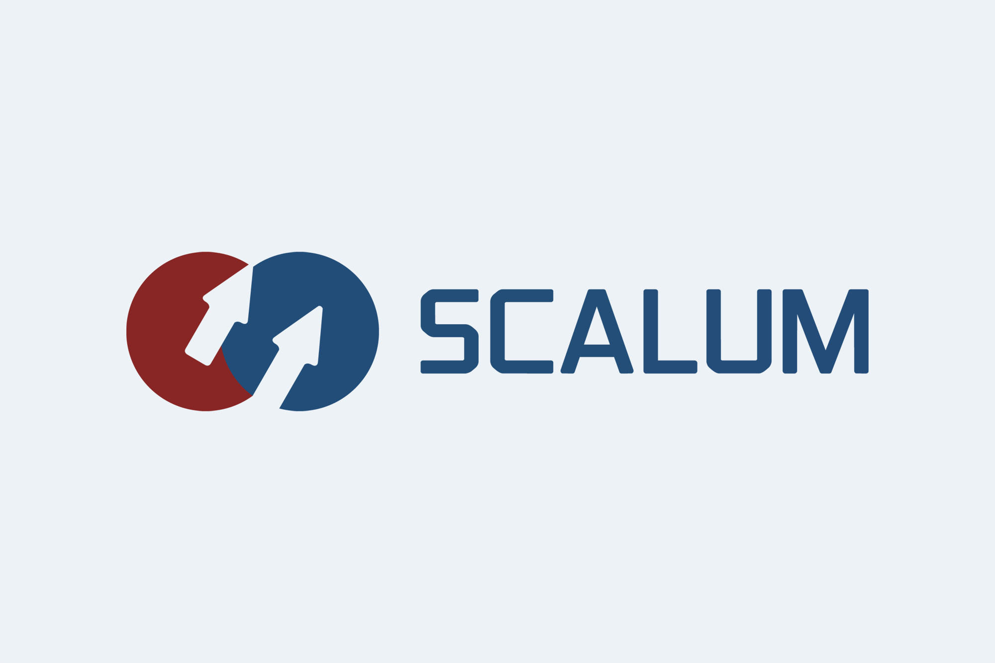
New logo for the scalum Group – symbol of structured scaling
With the introduction of its new corporate logo, the scalum Group is taking another step in the consistent development of its brand identity. The revised image reflects scalum's corporate claim as a strategic sparring and growth partner for startups and scale-ups.

The visual realignment stands for scaling and entrepreneurial clarity, while at the same time creating the basis for a group-compatible corporate structure from a design perspective - key elements of scalum's platform strategy and an expression of a clear, long-term growth orientation.
The central element of the new logo is two interlocking circles, which symbolize both scalum itself and the companies in the scalum environment - in particular our customers and portfolio companies, with whom scalum works in partnership. The circles represent exchange, proximity, and the close interconnection of corporate responsibility and strategic support. Their overlap illustrates that sustainable growth at scalum arises from close cooperation with the companies we support and whose business development we contribute to substantially.
Another defining element is the upward-pointing arrows integrated into the logo. They clearly and unambiguously represent scaling, progress, and development - key themes in scalum's self-image. The arrows underscore our commitment to not only advising our clients and portfolio companies, but also actively supporting them in their growth dynamics.
In addition, the new visual carries a subtle but deliberate ambiguity: in its overall form, the symbol can also be read as an “S” rotated by 90 degrees - an abstract reference to the name scalum itself. The logo thus combines symbolism and brand identity into a minimalist, distinctive symbol.

Founder & Managing Director – scalum GmbH
The new logo has been deliberately designed to serve as a design basis for other companies in the scalum Group and, in selected cases, for client and portfolio companies. It creates a consistent visual link across different companies and service areas, while at the same time enabling clear differentiation at the sub-brand level. The logo thus forms the basis for a scalable brand architecture within the entire scalum ecosystem.
With its new logo, scalum is creating a visual foundation for its growing service portfolio - from strategic advisory and investments to startup development and the planned introduction of structured offerings such as Continuous Advisory as a Service (CAaaS).
With its new look, scalum is emphasizing its commitment to structured growth and long-term support for entrepreneurial development. The logo thus symbolizes the strategic development of the entire scalum group.
Current blogs
In our blog section, we share news, specialist articles, ideas, and insights relating to entrepreneurship, investments, and technology.


